CeraVe

A large skincare site kept being redesigned, and kept breaking in the same place. I proved the failure was structural, then designed a fix that tested clean.

The site never stopped moving. So the testing followed it, version by version.

V1

Original site

no longer live

Same problems, first proof

Content inventory · Tree test (round 1)

V2

Interim redesign

no longer live

New paint, same failure

Heuristic eval · Cognitive walkthrough · Usability test

Proposed sitemap

my redesign

The structural fix

Tree test (round 2) · validated

Watching the same structural failure survive a full redesign (V1 to V2) is what turned a hunch into evidence, and told me the fix had to be architectural, not another coat of paint.


Solo

4 months

Figma · Proven by Users · Google Sheets

IA redesign · UX Research · Content Strategy

~6 min read· 6 sections· Read the bold lines for the 60-second version
01 · Snapshot

An information-architecture redesign that splits browsing, learning, and deciding into three separate paths.

Challenge

CeraVe had the content of a great skincare site; it just wasn't structured like one, and successive redesigns never fixed it. In tree testing, 90% missed the cleanser quiz and none located ingredient information.

Solution

An IA redesign on three moves: a top-level quiz hub, a predictable structure with four parallel ways to browse, and a scannable product page that surfaces comparison.

My role

Sole UX designer: heuristic evaluation, content inventory, cognitive walkthrough, tree testing, usability testing, and the IA redesign.

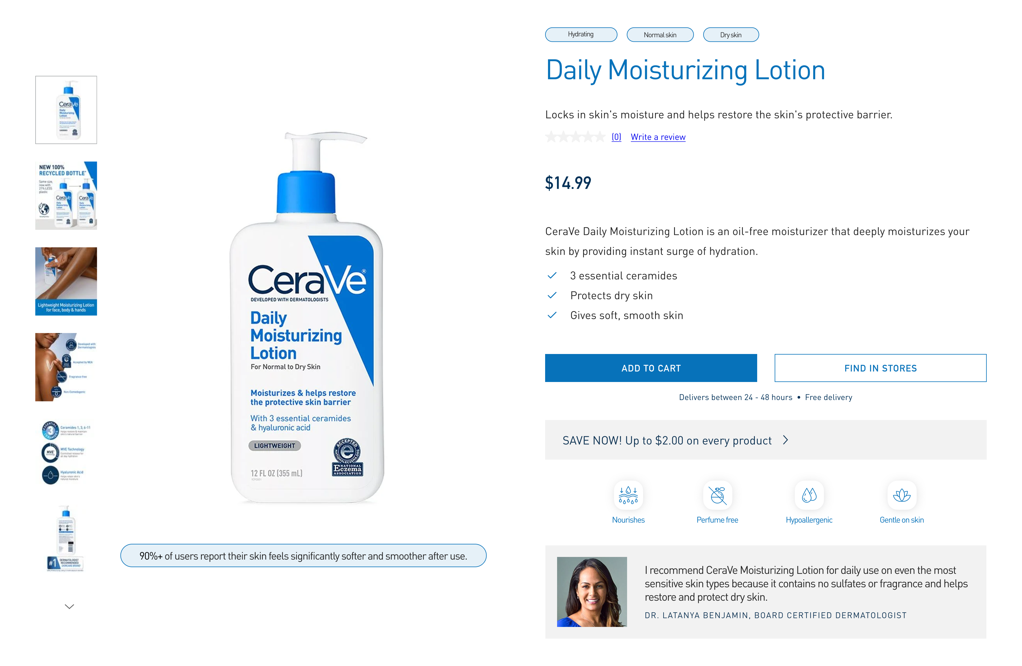
Redesigned CeraVe Daily Moisturizing Lotion product page.

The redesigned product page

0→70%now find ingredient information (a total failure in V1, resolved in re-testing)
6/8tasks reached ≥70% success on the redesigned sitemap
52usability issues logged (V2 diagnostic)
54.5SUS: the V2 baseline, below the 68 benchmark

The validation

A second round of tree testing on the redesigned sitemap confirmed the fix: the two breakdowns that defined V1 (the missed cleanser quiz and the unreachable ingredient content) both resolved. Directness is now the gap to close, not findability.

02 · Problem

CeraVe's product range had outgrown its site structure.

New categories, content, and tools had been layered onto an architecture built for a smaller catalog, and the navigation now competed with itself. Users struggled to predict where products belonged, locate the quizzes, and confidently compare products.

90%

of users failed to find the Facial Cleanser quiz in tree testing, and none located ingredient information at all.

01Dead ends when a category didn't lead where expected.
02Quizzes and ingredient guides users couldn't find mid-decision.
03Product pages too dense to scan or compare.
04The same thing labeled differently across sections.

The problem wasn't missing content. It was an information architecture that couldn't keep up as the catalog and its tools grew.

03 · Research

Six methods, one question: where does the structure break down, and does the fix hold?

Each method mapped to a version of the site (see the timeline up top). The content inventory and first tree test captured the original structure (V1); the heuristic evaluation, cognitive walkthrough, and usability test assessed a later interim redesign (V2); and a second tree test validated the proposed sitemap. The same findability problems recurred across both live versions, and the second round confirmed the redesign resolved them.

6methods triangulated
52usability issues logged
2rounds of tree testing
The six methods

Five methods diagnosed where the structure broke down; a sixth re-tested the redesign to confirm the fix. Click any one to see what I did and what I found.

Original site · V1 · no longer live

I mapped every page, navigation entry, and decision-support tool, capturing labels, locations, and overlaps.
  • Quizzes were duplicated, and one path led to the wrong page.
  • Ingredient information was buried inside the blog.
  • One quiz had two different names; sections looked inconsistent with each other.
  • Bestsellers couldn't be filtered by product type.

Original site · V1 · no longer live

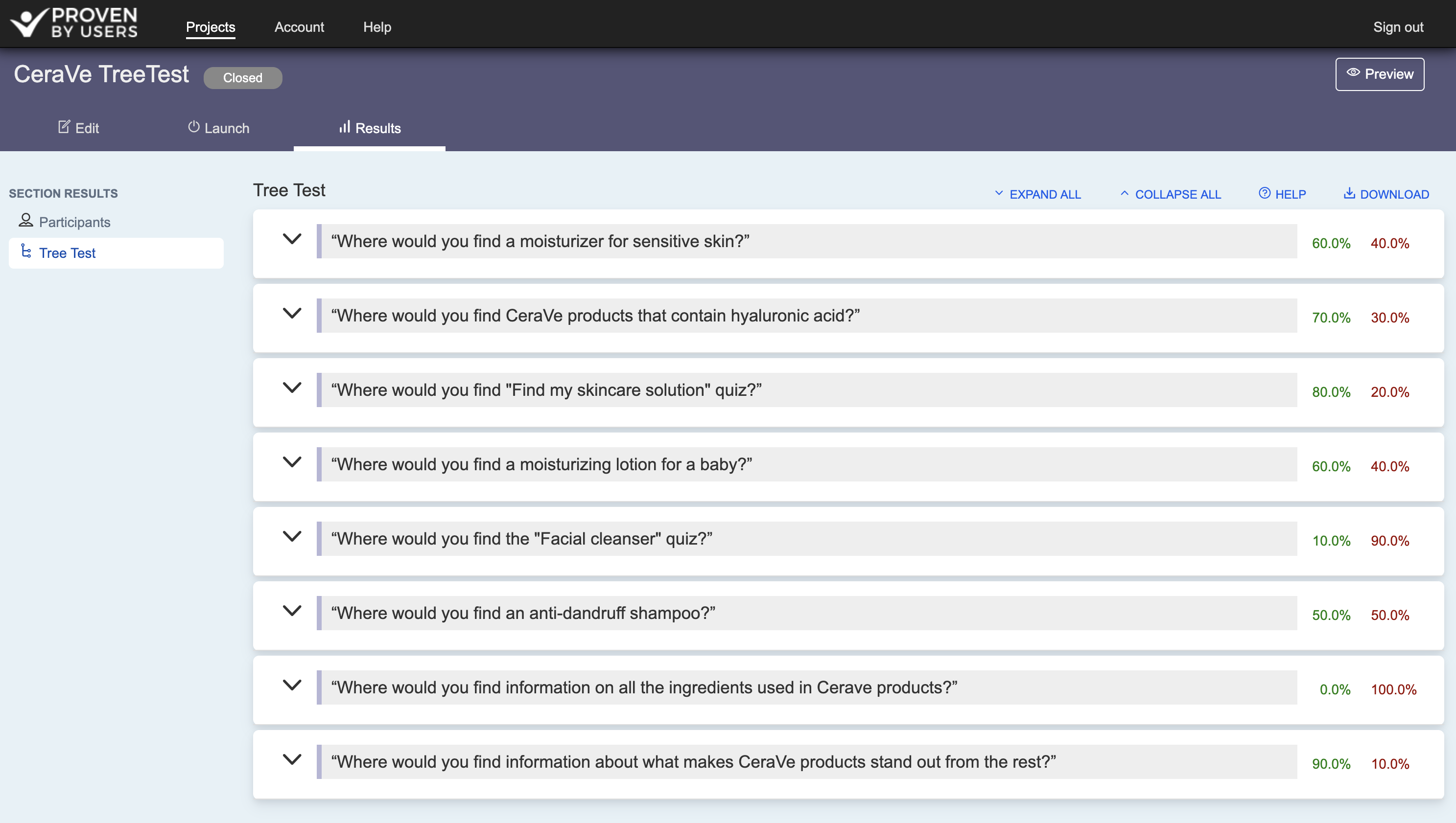
I ran tree-testing tasks on the live sitemap to measure success, directness, and time, with no visual or content cues.
  • 90% of users failed to locate the Facial Cleanser quiz.
  • 80% reached the skincare solution quiz, but only through indirect paths.
  • 0% successfully found ingredient information.
Proven by Users tree-test results for round 1, showing task-by-task success and failure rates.
Round 1 results (Proven by Users): task-by-task success rates on the V1 sitemap.

Later redesign · V2 · no longer live

I scored the desktop site against Nielsen's 10 usability heuristics, rating each issue for severity and frequency.
  • Logged 52 usability issues across navigation, content structure, and product pages.
  • Consistency and standards was the worst category: 17 violations.
  • Quizzes, filters, and ingredient content scored lowest on visibility and recognition.

Later redesign · V2 · no longer live

I walked through three core tasks step-by-step, applying Lewis & Rieman's four questions at each action and rating every breakdown for severity.
  • "Buy Online" implied checkout on CeraVe but redirected to outside retailers (severity 3).
  • The Skincare Solution Finder quiz was buried on the homepage, easy to scroll past (severity 3).
  • Quiz results overwhelmed users with too many recommended products (severity 3).

Later redesign · V2 · no longer live

I ran moderated remote sessions with five participants: think-aloud, three core tasks, and ASQ plus SUS ratings.
  • Participants found specific products easily through search and the nav bar.
  • 4 of 5 abandoned the skincare quiz; they expected to filter by concern.
  • 3 of 5 never found the comparison tool; the Compare button was too low-visibility.
  • The site scored 54.5 on the SUS, well below the 68 benchmark.

Redesigned sitemap · validation

I re-ran the original tree-testing tasks on the proposed sitemap with 10 testers, to check whether the new structure actually resolved the breakdowns the first round exposed.
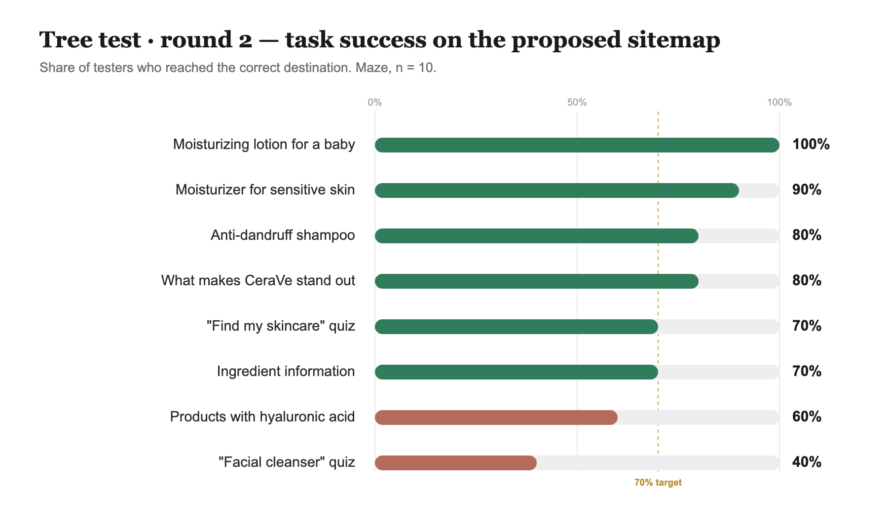
  • Ingredient information: 0% → 70% found it; the V1 total failure resolved.
  • Facial Cleanser quiz: ~10% → 40% found it; improved, still the weakest task.
  • The skincare quiz now succeeds directly (60% direct), not only through indirect paths.
  • 6 of 8 tasks cleared 70% success; baby-care and sensitive-skin were near-perfect.
  • Directness is the remaining gap: several tasks land correctly but by longer routes.
  • Three already-strong tasks slipped ~10 pts each. That's label competition, not a structural break. A tightening pass fixes it.
Bar chart of round 2 tree-test success rates by task on the proposed sitemap.
Round 2 success by task (Maze, n=10), consolidated from the per-task reports.
Key findings

Across two versions of the site, five methods told the same story, and a second tree test confirmed the redesign answered it:

01

Search worked; structure didn't

Users found known products easily, but discovery, decision-support, and comparison all broke down.

02

The tools meant to help were hardest to find

Quizzes, ingredient content, and comparison were buried: 90% missed the cleanser quiz, 0% found ingredients.

03

The structure competed with itself

Duplicate sections and inconsistent labels put the same content in several places under several names.

The problem wasn't missing content. It was an information architecture that couldn't keep up as the catalog and its tools grew.

04 · Design

Each finding pointed to a structural fix. The redesign came down to three moves.

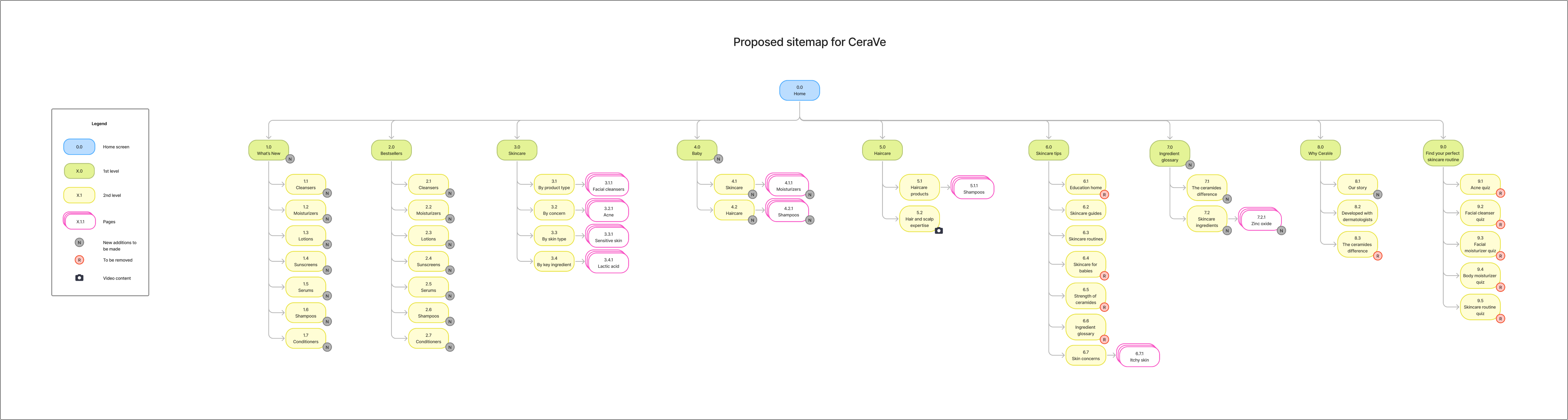
Most of the redesign is visible in the proposed sitemap: new sections give ingredients and decision-support their own homes, and redundant entries are removed.

Proposed sitemap for CeraVe: Home branching into What's new, Bestsellers, Skincare, Baby, Haircare, Skincare tips, Ingredient glossary, Why CeraVe, and Find your perfect skincare routine, with new (N) and to-be-removed (R) markers.
The full proposed sitemap. Green = top-level sections, yellow = sub-levels, pink = pages; N marks new sections, R marks removed ones. Click to zoom.
Decision · 01

Merged the quizzes into one hub

Insight

The quizzes were buried and split by concern, so finding help meant already knowing what was wrong.

Decision

Merge the separate quizzes into one top-level hub, named for the outcome people actually want.

Solution

Five scattered quizzes collapse into one hub: “Find your perfect skincare routine.”

Outcome

The tools that help people decide now sit where they look first.
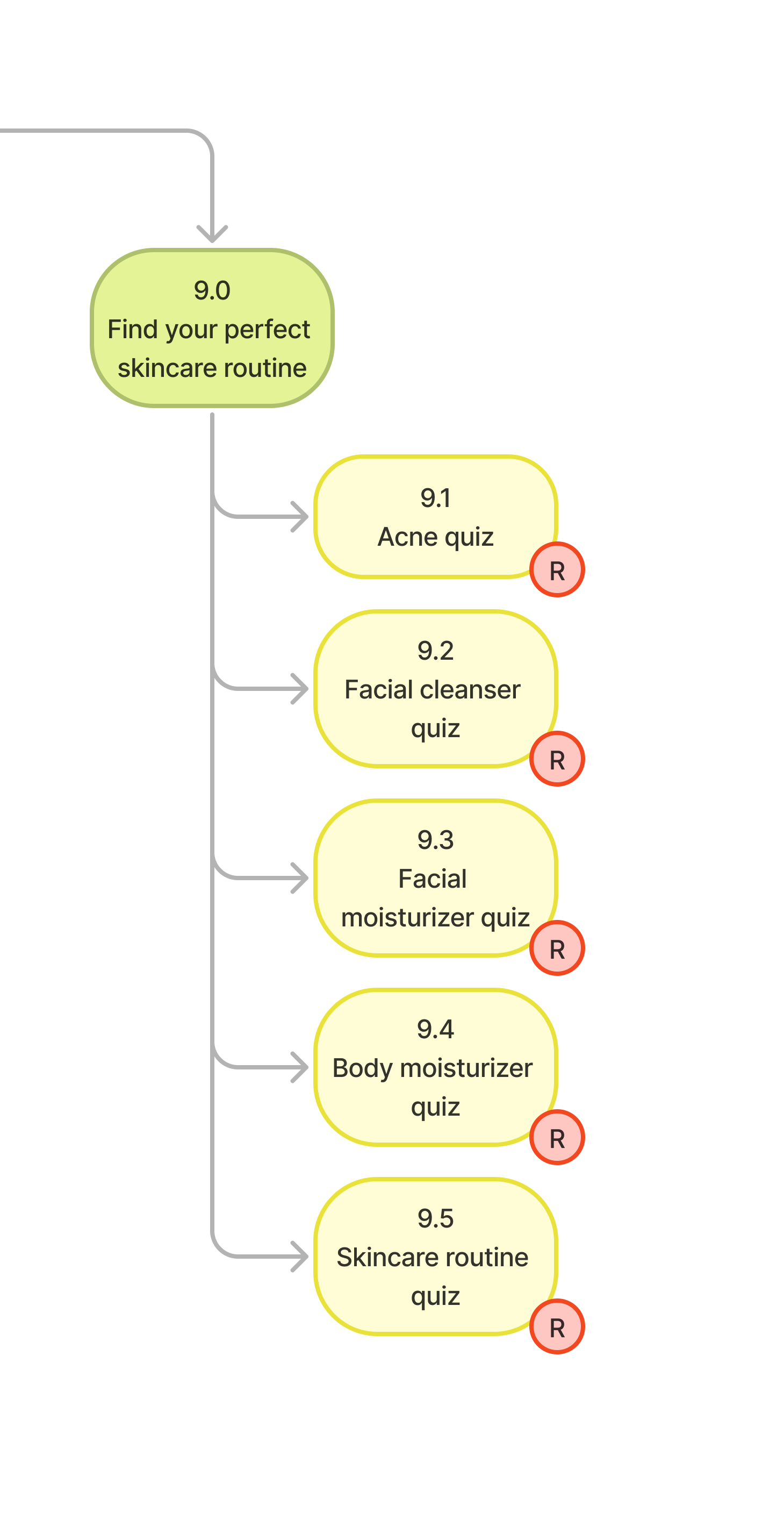
Proposed sitemap detail: the Find your perfect skincare routine hub with five quizzes (acne, facial cleanser, facial moisturizer, body moisturizer, skincare routine), each marked R for removal as standalone pages.

The five scattered quizzes collapse into one hub.
R marks pages removed as standalone destinations; N marks newly added sections. Click to zoom.
Decision · 02

Made the structure predictable

Insight

Duplicate sections and inconsistent labels meant users could never predict where a product lived.

Decision

Cut the overlaps and give each way of browsing one clear place.

Solution

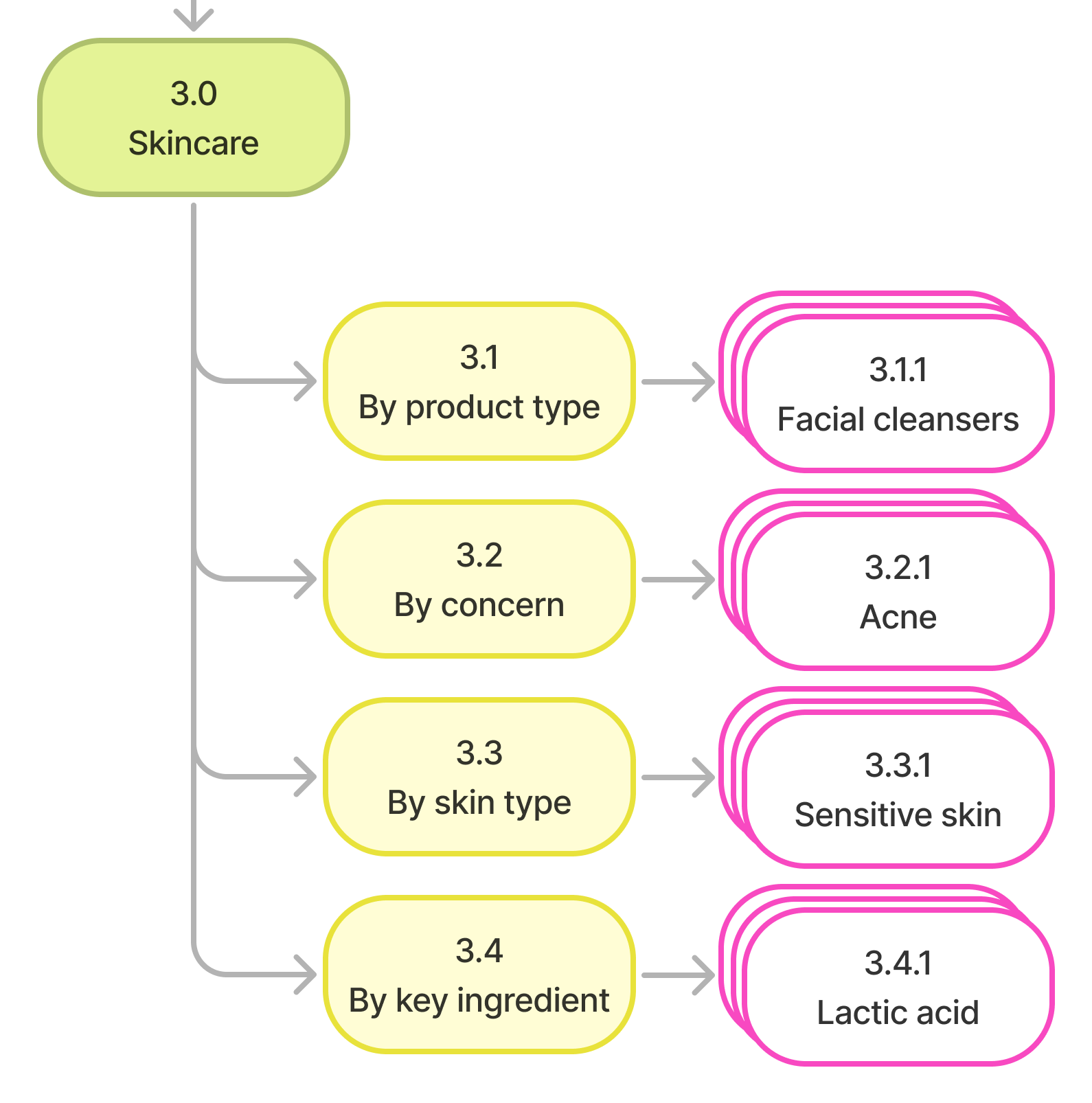
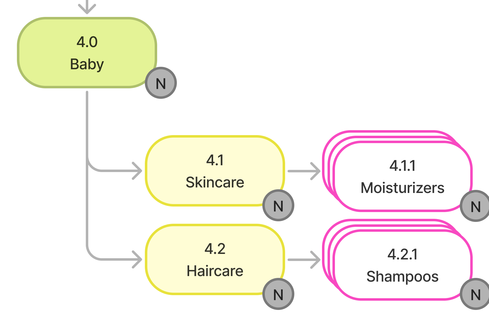
Skincare splits into four parallel facets (product type, concern, skin type, ingredient); duplicate entries were removed, and Baby and What's new got their own front doors.

Outcome

Users can predict where things live and switch between ways of browsing without collisions.

Proposed sitemap detail: Skincare split into four parallel facets (by product type, by concern, by skin type, by key ingredient), each leading to product pages.Proposed sitemap detail: Baby as its own top-level section with Skincare and Haircare sub-branches, all newly added.

Skincare browses four parallel ways (product type, concern, skin type, key ingredient); Baby gets its own front door.
N marks newly added sections; R marks removed ones. Click either to zoom.

Decision · 03

Simplified the product page

Insight

Product pages were dense, with 17 consistency violations flagged, and comparison was hard to find.

Decision

Lead with the decisions users actually make, and surface comparison.

Solution

The product page now opens with what it's for, who it's for, and what's in it, and surfaces comparison instead of burying it.

Outcome

Users can scan, compare, and decide without wading through dense copy.

8 changes · browse freely, or take the tour
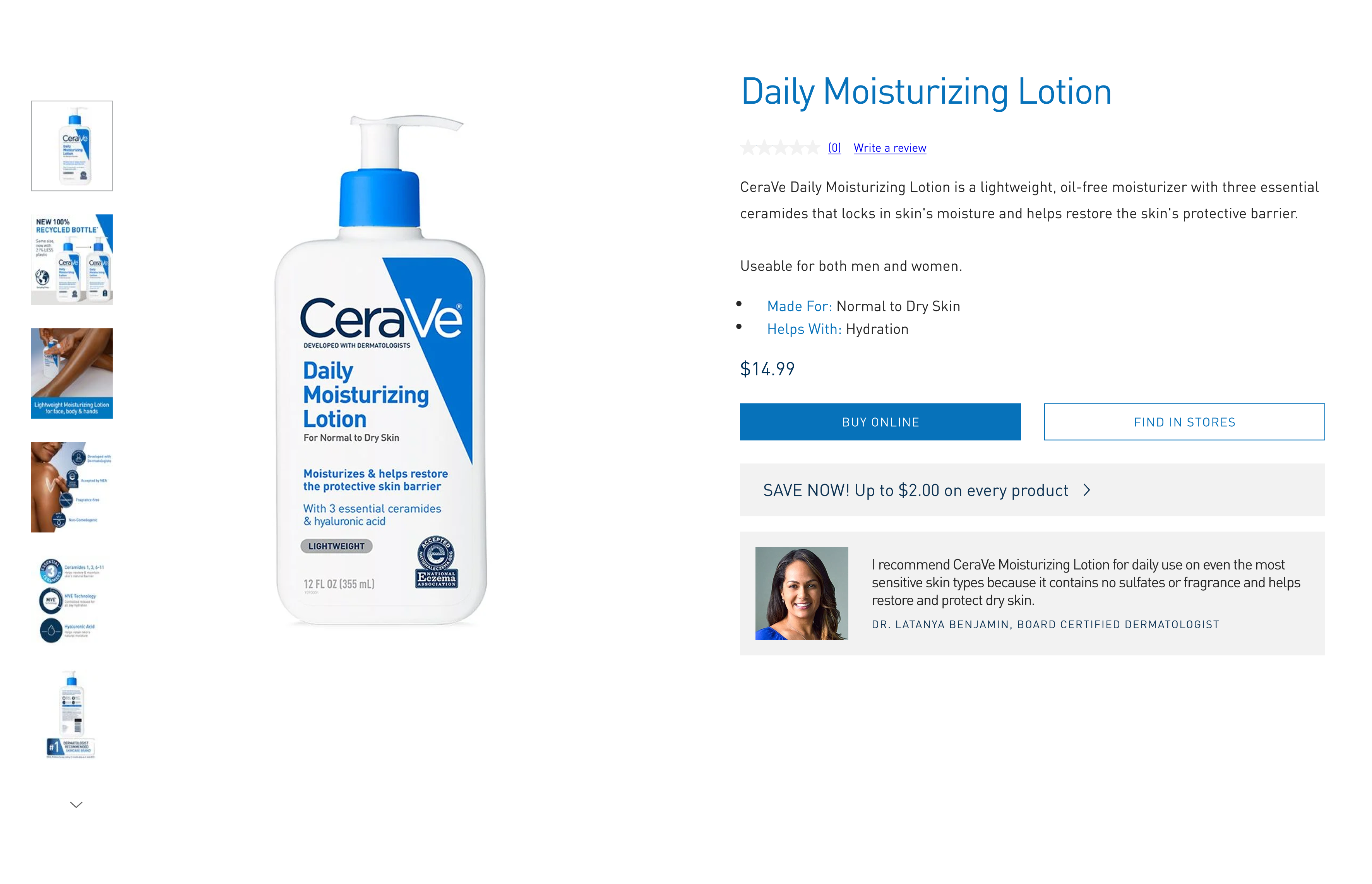
BeforeOriginal page
Original CeraVe Daily Moisturizing Lotion product page, before redesign.
1
Added in the redesign
AfterRedesign · click to zoom
Redesigned CeraVe Daily Moisturizing Lotion product page, after redesign.
1

After — this element

Change 1 of 8

The 8 changes — click any to focus it

Together, these moves turn a fragmented site into a connected system, where browsing, learning, and deciding reinforce each other instead of competing.

05 · Impact

A fragmented site becomes a connected system where browsing, learning, and deciding support each other.

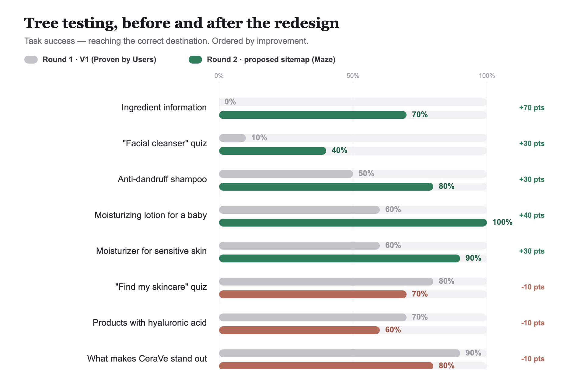
Before-and-after bar chart comparing round 1 (V1) and round 2 (proposed sitemap) task success rates across the same eight tasks.
Same 8 tasks, tree-tested on V1 (round 1) and the proposed sitemap (round 2), n=10 each.

What the redesign changes

01Quizzes and ingredient content sit at the top level, where users look first.
02No more duplicate sections or mismatched labels, so products are easy to predict.
03A simpler product page leads with what users need to decide.
04Comparison is surfaced, not buried.

What re-testing measured

01Ingredient information went from 0% found to 70%, the biggest single gain.
02The cleanser quiz rose from ~10% to 40% found; still the weakest task.
03The skincare quiz is now reached directly (60%), not only by accident.
046 of 8 tasks cleared 70% success, with baby-care and sensitive-skin near-perfect.

The remaining gap is directness: several tasks land correctly but by longer routes, pointing to labels that still compete, the focus for the next pass.

06 · Reflection

Information architecture is invisible until it breaks; then it shapes every interaction.

A second round of tree testing validated the core bet: success rose across nearly every task, and both V1 breakdowns (the missed cleanser quiz and the unreachable ingredient content) resolved. What it also surfaced is that findability and directness are different problems. Several tasks now succeed but by indirect routes, so the next iteration is about sharpening labels, not restructuring.

What I learned

  • Even helpful content becomes difficult to use when navigation feels inconsistent or unpredictable.
  • IA is invisible until it breaks; then it shapes every interaction.
  • Tree testing surfaces structural breakdowns that visual review and heuristic evaluation alone cannot.

My next steps

  • Sharpen the labels behind the low-directness tasks (cleanser quiz, hyaluronic acid) and re-test.
  • Extend the IA system to mobile navigation and search.
  • Complete the product-page hierarchy and comparison flows on top of the new structure.

The redesign shifted CeraVe from a content-rich but confusing site into a predictable, navigable site that shoppers can trust.