Start Simple with MyPlate

Designing a simpler, more motivating nutrition experience for everyday habit building.

Team of 5

10 weeks

Figma · FigJam ·
OpinionX · Maze

Feature redesign · Research · Prototyping

~5 min read· 6 sections· Read the bold lines for the 60-second version
01 · Snapshot

A research-grounded redesign that makes healthy eating simpler and easier to act on.

Challenge

The USDA's MyPlate app set out to build healthier eating habits, but usability testing showed its core actions were confusing and hard to complete: two in five people couldn't finish the basics.

Solution

A redesign around three research-backed bets: flexible food logging, personalized goals, and a multi-level progress dashboard, making healthy eating simpler, more personal, and easier to act on.

My role

Led the end-to-end redesign on a team of five: feature design, a 38-person MaxDiff study, prototyping, and the concept test that validated it.

Redesigned meal logging

Redesigned meal logging

6/6understood every redesigned screen
5.0/7avg. perceived ease (SEQ)
77.5SUS: “good,” up from 74.5
2problems to fix next round

The honest challenge

Our testers skewed younger and more tech-fluent than MyPlate's federally-tied user base. The friction we fixed was real, but the numbers only earn full trust after a second round with older, lower-income users.

02 · Problem

Healthy eating shouldn't feel this complicated.

The content was credible, USDA-backed and free, but the experience didn't support everyday behavior change. App-store reviews and our own testing pointed at the same thing: friction showed up everywhere users actually needed to act.

40%

of participants failed to complete essential tasks in round-one usability testing, limiting the app’s ability to support consistent habits.

01Key actions were hidden, so users had to hunt for them.
02No simple way to log what they actually ate.
03Generic targets that didn't feel like their own.
04No sense of whether they were making progress.

For a habit-building app, it wasn't helping anyone build habits.

03 · Research

Five methods, all chasing one thing: what stops people from using this app to eat healthier?

We triangulated market expectations, user sentiment, and real behavior so the redesign would follow evidence rather than assumptions. Each method answered its own question; together they converged on the same three gaps.

5methods triangulated
38survey participants
4competitors benchmarked
The five methods

Each method answered its own question. Click any one to see what we did and what we found.

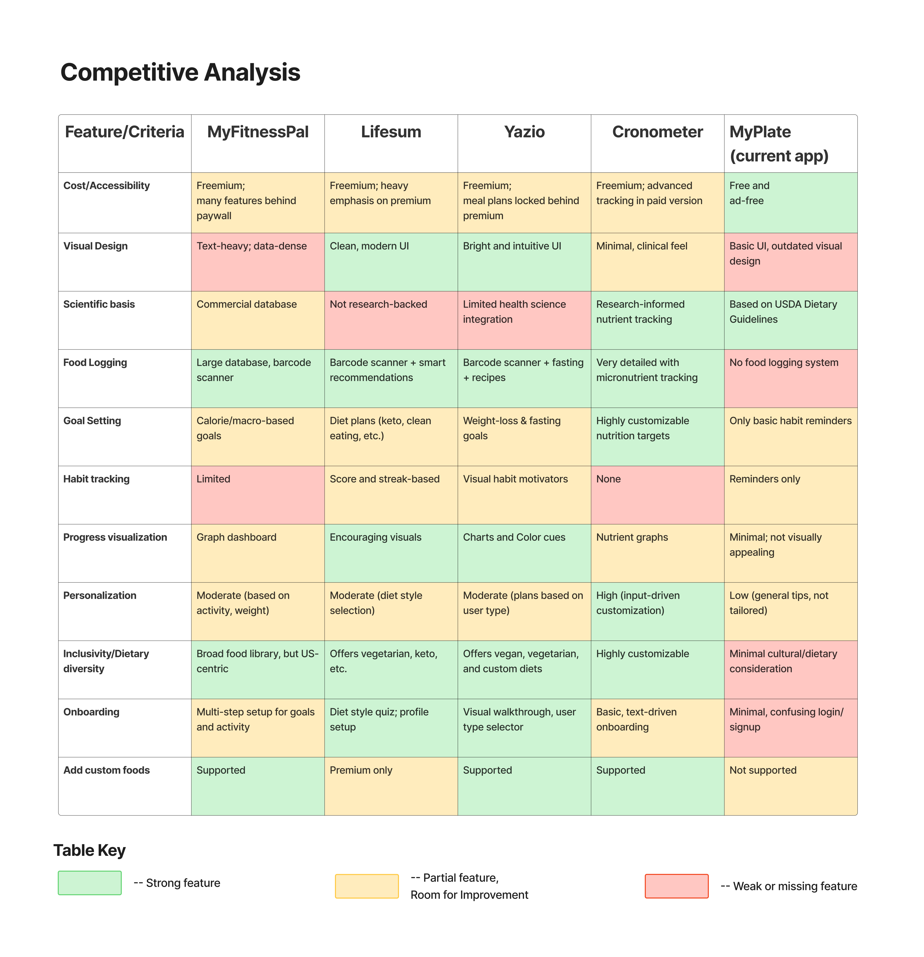
Benchmarked MyPlate against MyFitnessPal, Lifesum, Yazio, and Cronometer across logging, personalization, habit tracking, progress, and onboarding. Strengths: free, ad-free, USDA-backed. Gaps: no food logging, no personalization, dated progress views, no modern onboarding. Implication: add flexible logging, personalized goals, clear progress feedback.
Feature-by-feature comparison across five nutrition apps
Feature-by-feature comparison across five nutrition apps.
We analyzed app-store reviews and online discussion to gauge how people felt about MyPlate in the wild.
68%
22%
10%
Negative Positive Neutral
  • Users trusted the USDA-backed content, but many found the app hard to use day-to-day.
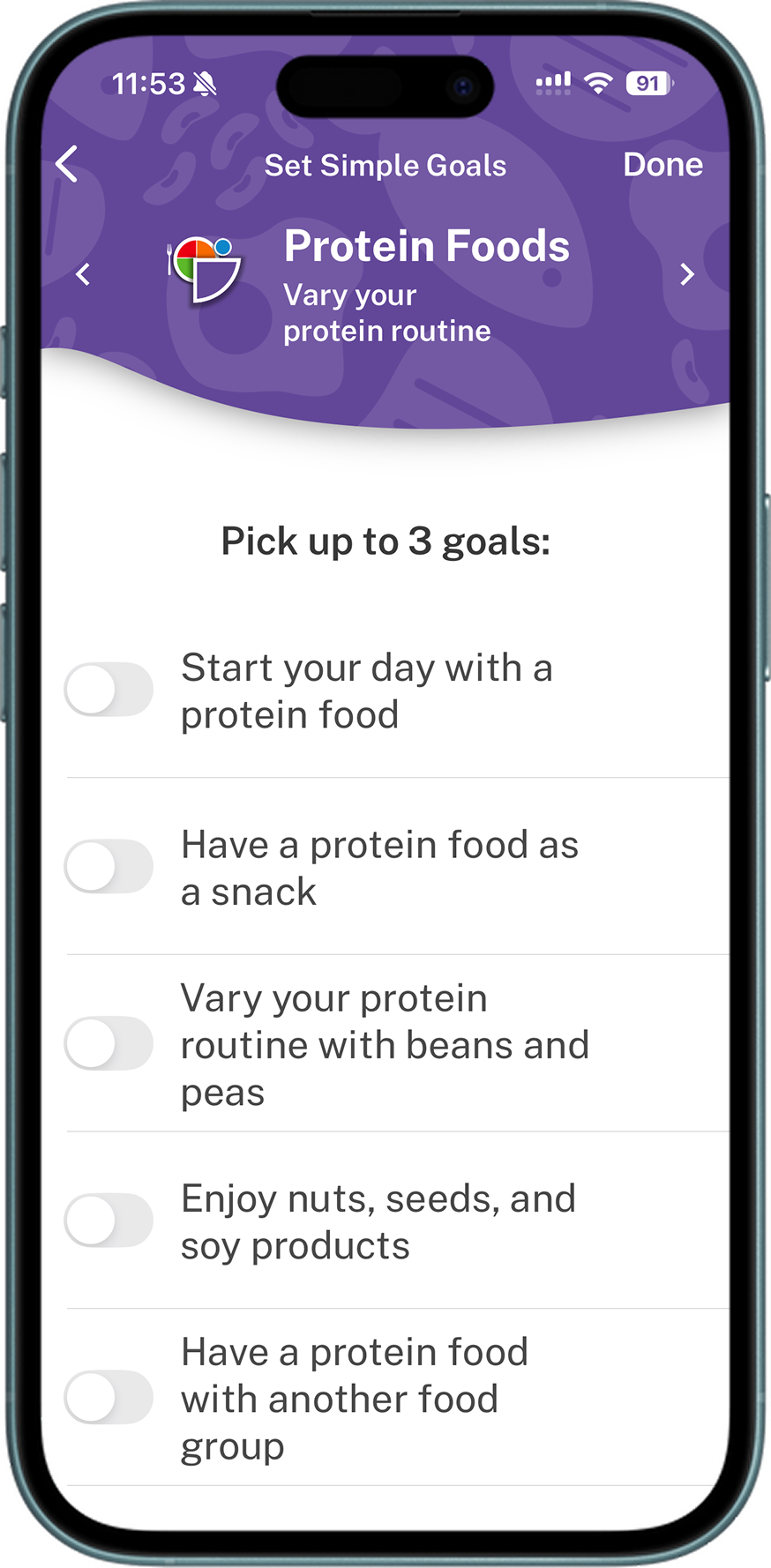
We ran moderated sessions with five U.S. participants across three core tasks: understanding current eating habits through a quiz, reviewing progress over time, and setting a protein goal. For each task we tracked completion and time on task, then collected a System Usability Scale (SUS) score for the experience overall.
74.5SUS, a “fair” score 3/5passed the habits quiz ~6.5mspent on the quiz task
  • The habits quiz was the clear weak point: only 3 of 5 interpreted and completed it correctly, and several struggled to navigate the flow.
  • Users could reach progress and goal-setting, but the path there was not always obvious, and some needed help to get there.
  • Goal-setting offered no guidance on which option fit a given person, so participants felt unsure of the choices they made.

“It doesn't feel like it accounts for my being vegetarian.”

That SUS of 74.5 set the baseline this redesign is measured against, and the failure points it exposed became the problems the redesign had to solve.

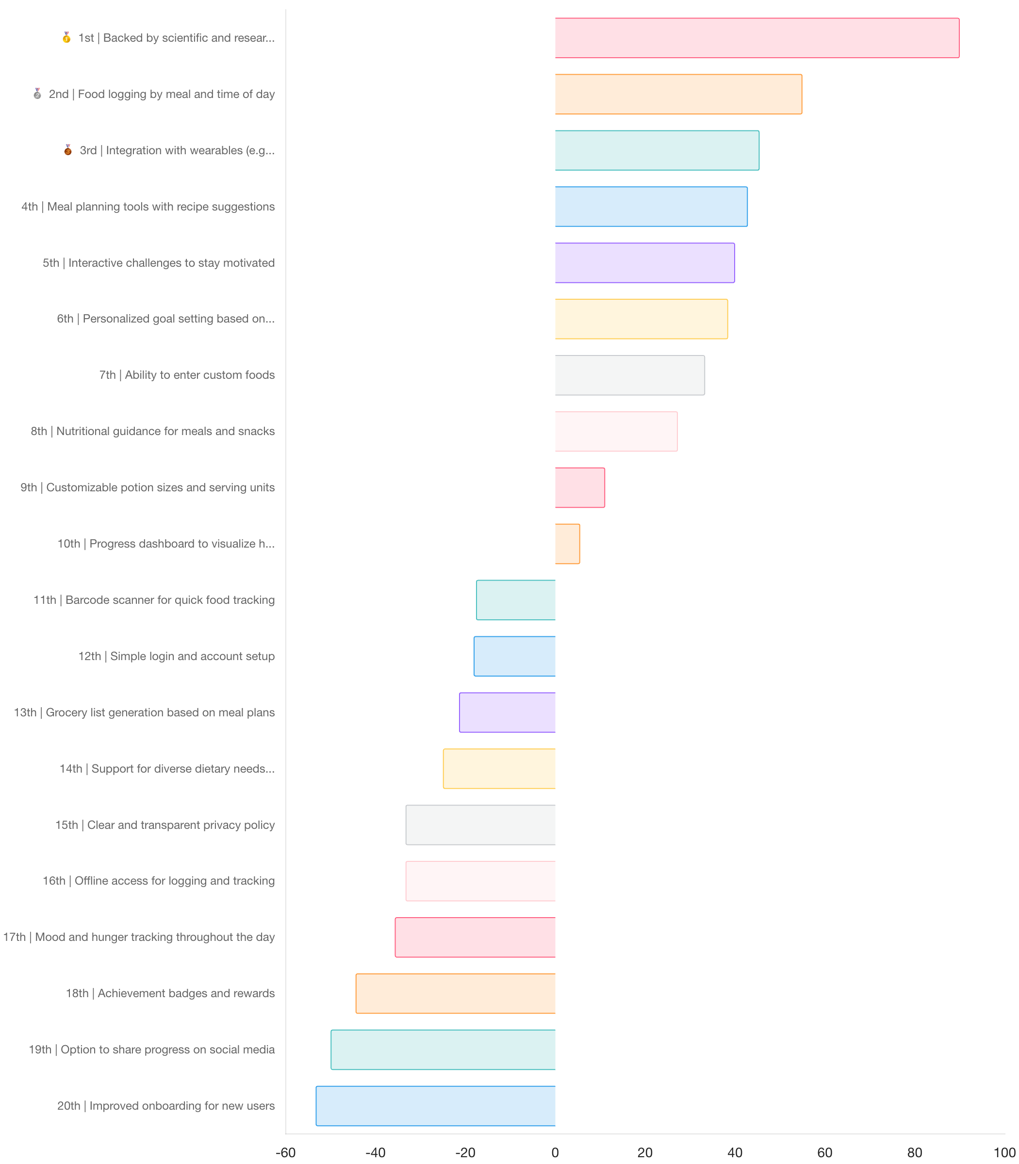
Forced-choice trade-offs (OpinionX) ranked a feature pool drawn from the earlier methods.
  • Top: evidence-based guidance, personalized goals, custom food entry, flexible logging.
  • Bottom: badges/streaks, social sharing.
  • Implication: focus on logging, goals, and guidance, not gamification.
MaxDiff best-worst feature ranking
Most and least important features by Best/Worst score (38 participants).
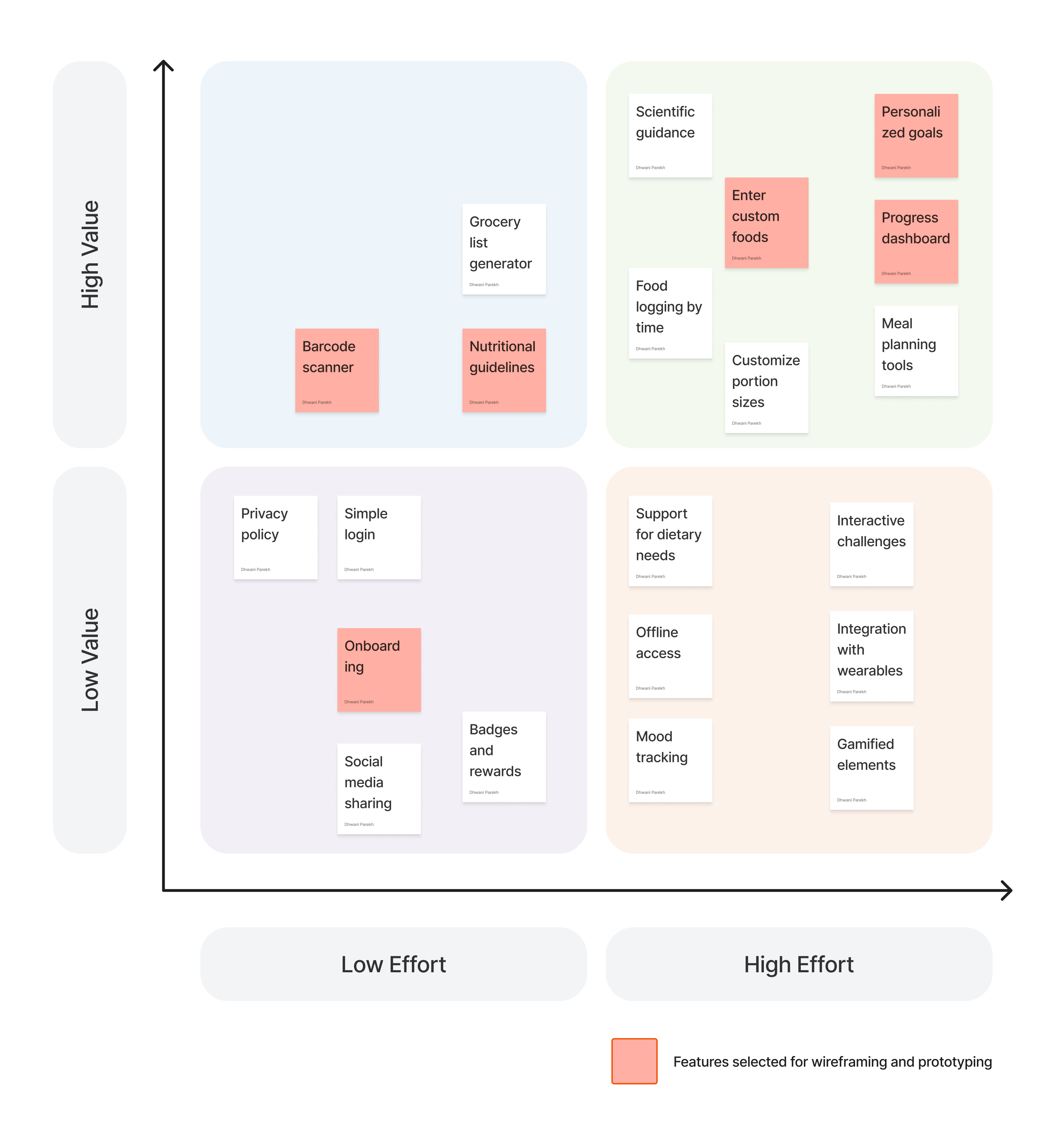
Plotted MaxDiff value against build effort.
  • Build first / next: barcode scanner, personalized goals, custom foods, progress dashboard.
  • Skip: social feed, public sharing.
Value vs effort priority matrix
Value-vs-effort matrix used to sequence the build.
Key findings

Across all five methods, three findings defined what the redesign had to deliver:

01

Generic goals fell flat

Users wanted goals that fit their own routines and preferences, not one-size-fits-all targets.

02

No way to log meals

Users needed a quick, flexible way to track what they ate. The original app had none.

03

Progress was invisible

Users needed clear feedback to see whether they were staying on track.

These three findings became the three design decisions below.

04 · Design

Three barriers became three design decisions.

Before · where MyPlate started

Three gaps research surfaced. Each one is answered by a decision below.

No logging existed
Logging: no way to record a meal at all.
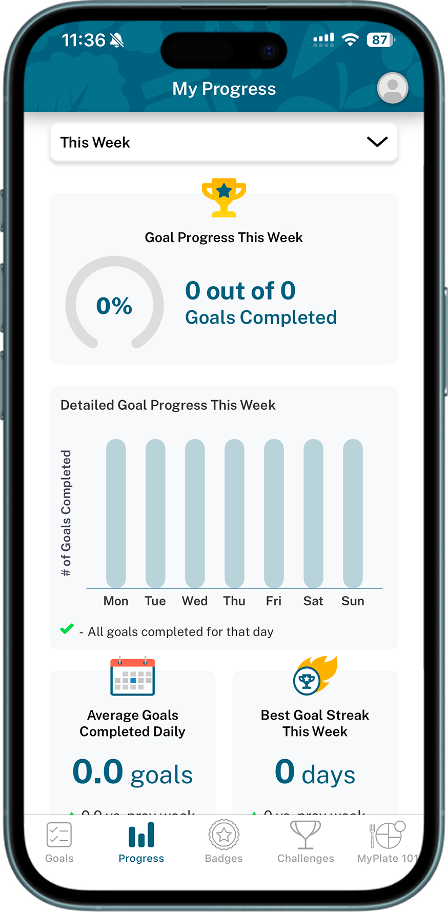
Original MyPlate goal setup
Goals: a generic list, no guidance on what fit you.
Original MyPlate progress
Progress: a weekly summary only.
Decision · 01

Flexible food logging

Insight

Users needed simple ways to log what they actually ate.

Decision

A flexible logging experience that reduces friction at the moment people most often abandon a nutrition app: adding what they just ate.

Solution

Four entry points feed one lightweight logging flow, so any eating pattern has a fast path in: pick a meal, scan a food with the camera, search a database of common items, or add a custom entry for anything off-list. Users start by choosing the meal (breakfast, lunch, dinner, or a snack), then add to it however is quickest.

Outcome

One flow now supports packaged foods, homemade meals, and culturally diverse diets, removing the friction that kept people from logging at all and meeting users where their habits already are.

4 ways to log
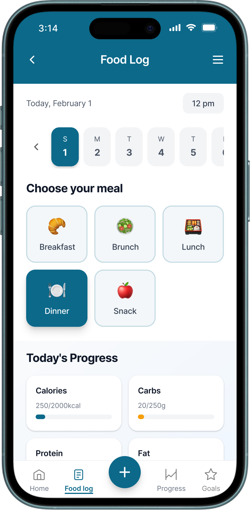
Meal-based logging

Start by picking the meal: breakfast, lunch, dinner, or snacks.
Decision · 02

Personalized goals

Insight

Generic goals don't motivate behavior change.

Decision

A guided, three-step goal flow built around personal motivation rather than a generic list of presets.

Solution

Instead of dropping users onto a list of numeric targets, the setup walks them through three decisions: what they want, where to focus, and how they'd like to track it:

  1. Choose a primary goal, based on personal motivation.
  2. Select food groups, focus on what matters most.
  3. Choose a tracking method: meals, servings, days, or yes/no.

Outcome

Helps users create more relevant goals and makes it easier to get started.

Prototype walkthrough

A three-step flow built around what motivates each user.

Decision · 03

Progress dashboard

Insight

Users can't improve what they can't see.

Decision

A multi-level progress system across daily, weekly, and monthly views.

Solution

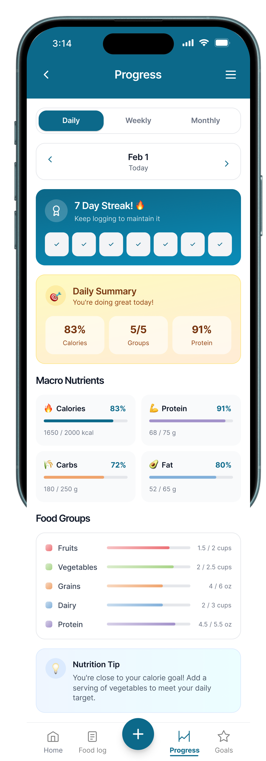
Three layered views answer different questions: a daily view for immediate course-correction within the same day, a weekly view that surfaces patterns and consistency, and a monthly view that shows cumulative improvement over time, so feedback is available at whatever horizon the user cares about.

Outcome

Progress became something users could see and act on, not just data they logged, and the app shifted from a passive record into an active feedback loop.

3 progress views

Daily progress

Immediate feedback: see how today's intake tracks to goals.

05 · Results

Concept testing validated the core bet, and surfaced the two fixes that lead the next round.

Concept-tested the three flows with 6 participants (first-click, comprehension, SEQ/SUS). Each row pairs the round-one baseline with what the concept test actually achieved and the target still ahead. Targets are the next bar to clear, not results already banked.

MetricBaseline (measured)Achieved · concept test (n=6)Target
System Usability Score68 is the industry average; the redesign reached 77.5, with 80+ as the next target.
74.5Above avg.
77.5✓ “good”
≥ 80Excellent
Core-task completionClose the 40% failure rate that defined the problem.
60%3 of 5
83%✓ 5 of 6 first-click
≥ 90%Goal
Goal-setup easeGuided flow replaces a generic list of options.
LowUnsure which goal fit
5.0~ 1 step to fix
SEQ ≥ 5.5/ 7
Validated

Entry point found on instinct

5 of 6 went straight to the meal selector to record a meal.

Iterate

Tracking-method step needs work

The “how to track” step confused 2 of 6. Next: reorder and relabel; allow multiple goals.

Validated

Progress read and acted on

Clearest flow (5.3/7); people named a next step. Next: add reference ranges.

06 · Reflection

Research is only as honest as its sample.

Our sample skewed younger and more tech-fluent than MyPlate's real audience, which spans a far wider range of ages and incomes. The redesign solves the friction we saw, but before calling any flow ready, I'd run a second round that deliberately broadens the sample. Only then is it validated for the whole audience, not just the part we reached.

What I learned

  • Motivation has to be designed in, not bolted on.
  • Flexible inputs beat strict ones.
  • A clean method doesn't fix an uneven sample.

My next steps

  • Re-test with a broader, representative sample.
  • Adaptive goal recommendations.
  • Habit-based notifications at decision moments.